a design case study
Why it looksthe way it does
Every decision in this project came from a constraint agreed with the confectioner — not from taste. Here is the brief, what limited us, and what each limitation turned into.
the brief
A studio of one,selling through messages
A confectioner and painter making exclusive pastries, hand-rolled bonbons and meringue bouquets. One small kitchen, a handful of orders a day, delivery across the city.
Sales ran entirely through direct messages. There was no window to look at, so every new customer needed the same conversation: what exists, what it costs, when it can be ready. Growth was limited by her hours, not by demand.
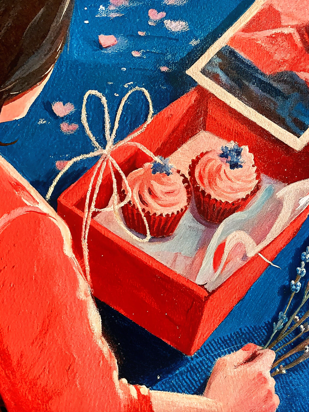
The one strong asset nobody was using: a body of original gouache paintings of her own work.
- 1
Present the range as artwork, not as home baking.
- 2
Justify a high price before anyone asks for it.
- 3
Cut the back-and-forth: enquiries should arrive with occasion, date and tastes.
- 4
Produce something showable as a portfolio piece.
the constraints
Five limits,five arguments for the sale
None of these decisions is a compromise made for lack of resources. Each one is a production limit deliberately translated into a reason to buy.
No photography, no budget for a shoot
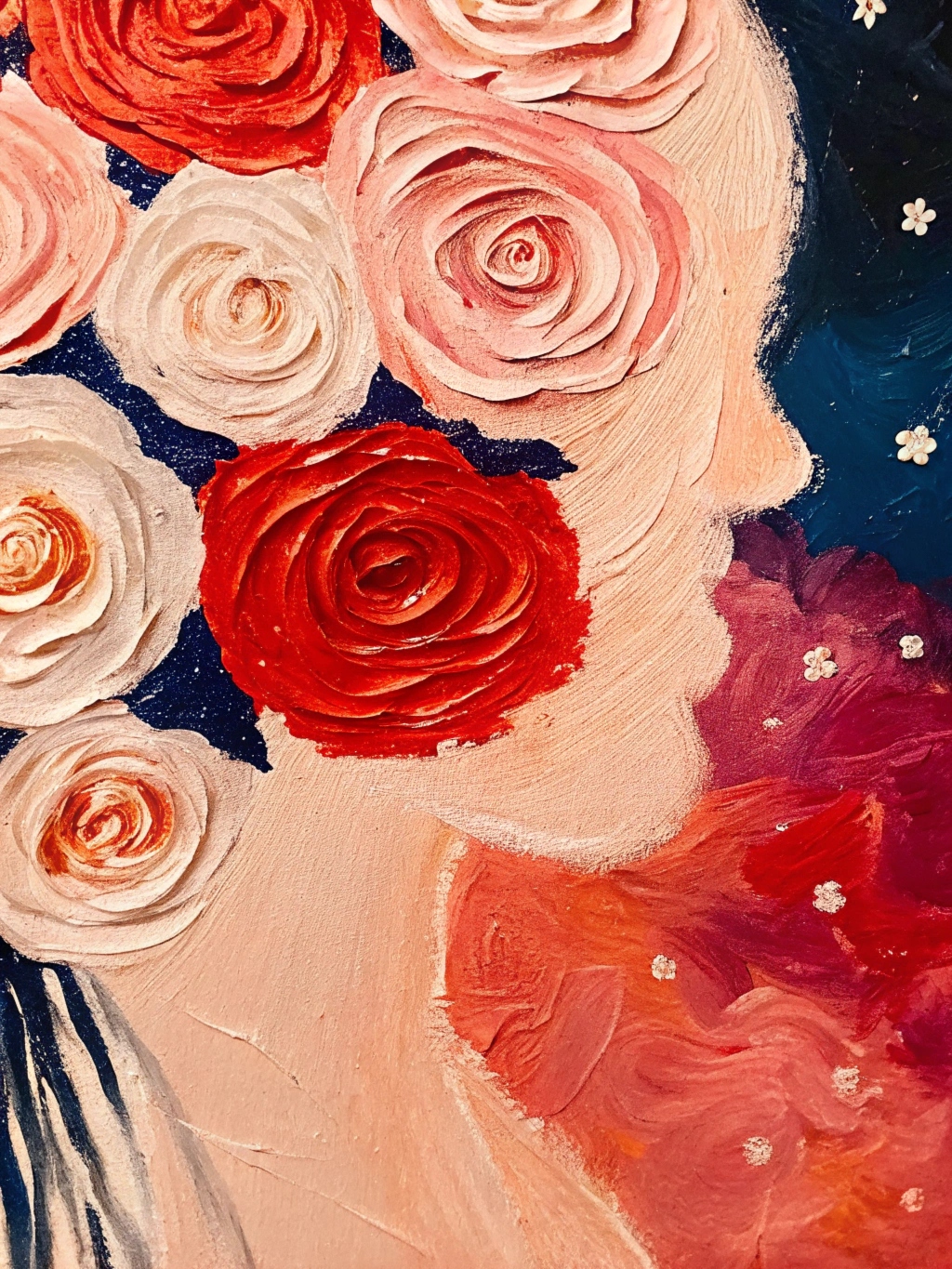
The whole site is built on the confectioner's own gouache paintings — cheaper than a shoot and impossible for anyone else to copy.
The illustrations must never be altered
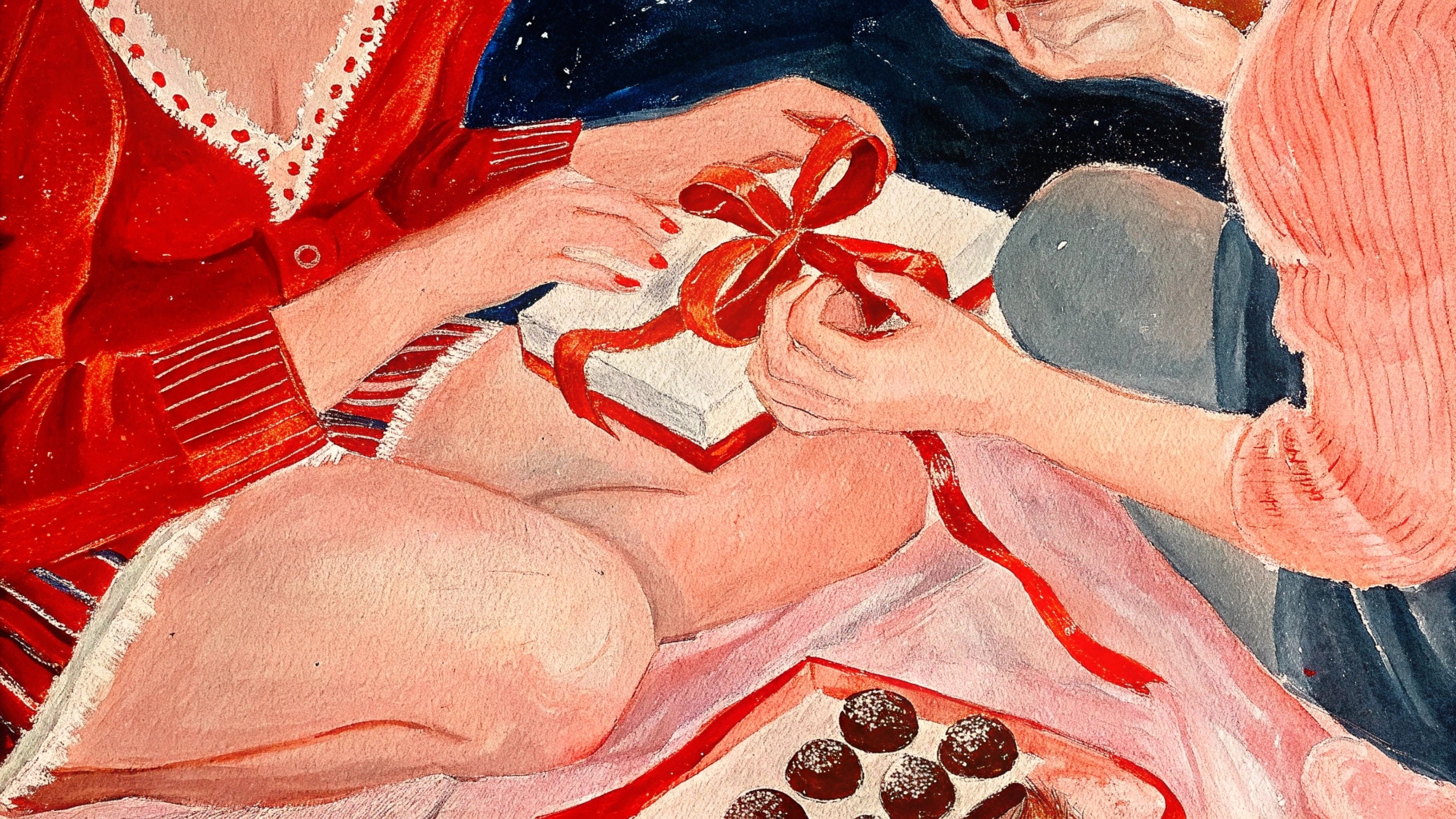
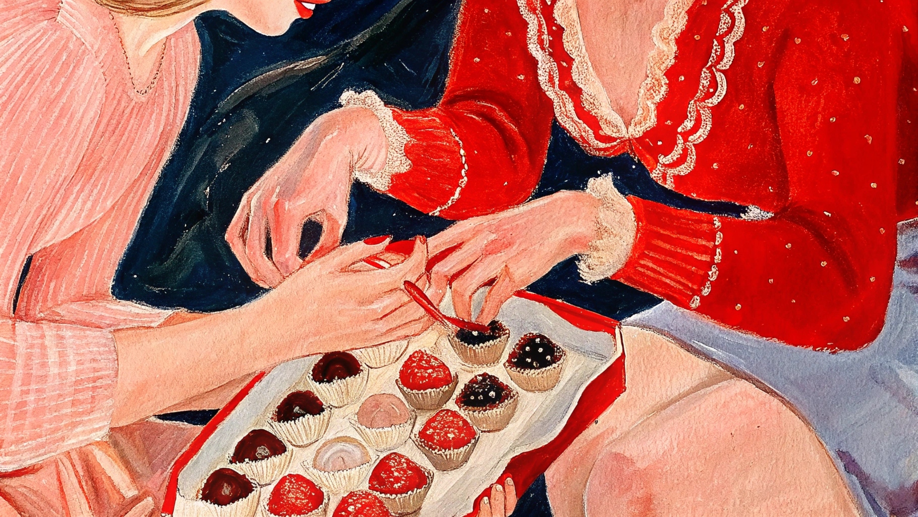
Design works only around them: deckle-edge frames, lace scallops, ribbons, seals. The artwork itself is untouched — no crops to fit a grid, no filters.
A hard production limit of a few orders a day
The limit became the offer: “five orders a day and never a sixth”. Scarcity instead of an apology.
Nothing is kept in stock — everything is made to order
No cart. The journey ends in a written note, not a checkout, because that is how the studio actually works.
A team of one
No admin panel, no fragile logic. The site can be kept alive without a developer on call.
the concept
The site as a paper objecta card, an envelope, a ribboned box
We did not design a confectionery website. We designed a continuation of the packaging. Someone who receives a box with a wax seal and a handwritten tag should recognise the same language on screen — otherwise a gap opens between the promise and the product, and that gap is exactly where customers start to negotiate.
- I
Colour taken from the paintings
Cobalt, vermilion, cream and blush are lifted straight out of the artwork — nothing was added by the designer. The illustrations are not placed on the site; they are the site. Cobalt as a base is rare in food, where beige and white dominate, so the studio is recognisable after one scroll.
- II
Typography as craft
Playfair Display carries weight and status. Italic Cormorant Garamond gives the tone of a letter rather than an advert. Pinyon Script is reserved for prices only — a handwritten number reads as a personal arrangement, not a price list, and stops the visitor comparing it to a supermarket shelf.
- III
A handmade interface system
Deckle paper edges and slight rotations make each painting look physical. Lace scallops replace ordinary section borders, ribbon rules sit under headings and buttons, wax seals number the process, and paper grain removes digital sterility.
- IV
An envelope instead of a lead form
The order form is a note with a flap and dashed rules, and it asks exactly what the confectioner used to ask over five to ten messages: the occasion, the date, the tastes. Every enquiry now arrives already qualified.
the structure
Three pages,each with one job
- Home
- The promise, a short counter, the studio and the note. It has to be enough on its own.
- Collections
- The full range, each piece with the story of how it is made — the page that carries the price.
- Atelier
- The maker, the rules of working with her, the reason for the wait.
A cart and payment are deliberately left for a later stage. They only make sense once the studio decides it wants volume. Today the goal is the value of each order and the right kind of customer — and the design is built for that.
why it earns
What the designis meant to do for the business
A higher basket
Price is read through context, not through the number. Hand-set typography, original painting and paper texture create the context of a gallery — and in a gallery nobody haggles.
Fewer messages per order
The form collects the brief up front, so the studio spends its time making rather than qualifying. For a maker working alone, saved time is production capacity.
The wrong enquiries filtered out
Lead times, the daily limit and delivery costs are stated on the page. “Today and cheaper” never reaches the inbox.
Stories instead of specs
Every item carries a paragraph about how it is made. Like any luxury category, what is bought is the reason the price is what it is.
Distinction that cannot be copied
The niche is visually uniform: photos on white, pink type, rounded cards. Cobalt, paint and handmade detail give a signature tied to one artist's hand.
An identity, not a page
The same system moves to packaging, tags, cards and social media. The site is infrastructure for the brand, not a one-off expense.
see it in use